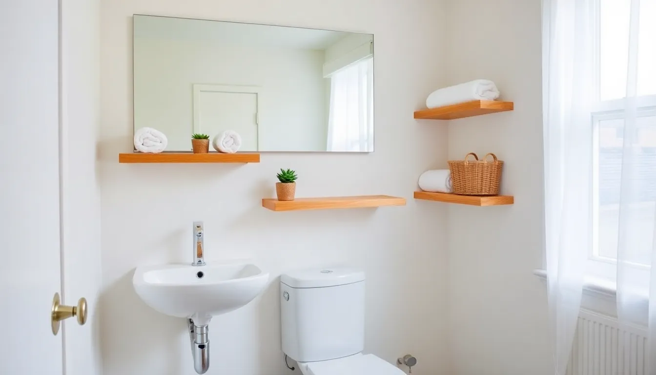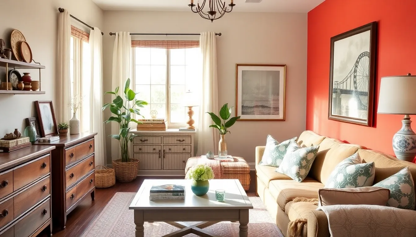
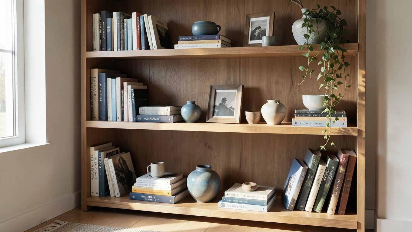
Your bookshelf doesn't have to look like a chaotic library explosion or a sterile showroom display. The difference between a shelf that feels thoughtfully curated and one that just holds stuff comes down to a handful of intentional choices. Whether you're working with built-ins, a standalone unit, or floating shelves, the same principles apply. You want a space that showcases your books and treasures while giving your eyes somewhere pleasant to land. The good news? You don't need a design degree to pull this off. With a few strategic moves and a bit of patience, you can transform your bookshelf into a focal point that feels both personal and polished.
The Foundation: Books and Balance
Start with your books, because they're likely the main event. A well-styled bookshelf typically features about 60% books and 40% decorative objects and empty space. That ratio keeps things interesting without overwhelming the eye. Too many books crammed together starts looking like storage rather than display, while too few makes the shelf feel underdressed.
Mix up how you arrange those books. Vertical rows are the default, but horizontal stacks break up the monotony and create elevated platforms for small decorative pieces. Stack three or four books flat, then place a small vase or sculptural object on top. This layering trick adds dimension and makes use of space that would otherwise go to waste. When you're arranging vertical rows, consider grouping books by color if you want a sleek, cohesive look, or by subject if you actually want to find them again.
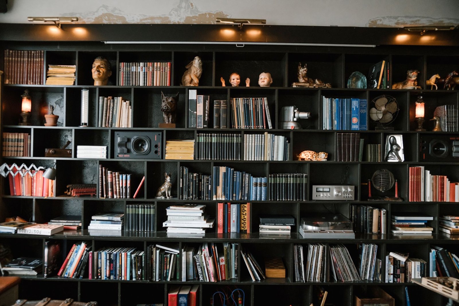
Visual weight matters more than you might think. Place your largest, heaviest books on lower shelves. This creates a sense of stability and prevents the whole unit from feeling top-heavy. Nobody wants to stare at a bookshelf that looks like it might tip over. Those oversized art books and chunky textbooks? Bottom shelves. Reserve the upper levels for smaller volumes and lighter objects.
Objects, Layers, and the Rule of Three
Decorative objects give your bookshelf personality, but random placement makes them look like clutter. Group items in odd numbers, particularly threes. Three candles of varying heights, three small pottery pieces, three framed photos. There's something about odd-numbered groupings that feels more natural and less staged than pairs or even numbers. Your brain processes them as a cohesive vignette rather than a collection of unrelated stuff.
Layering creates depth that flat arrangements can never achieve. Place a framed piece of art leaning against the back wall, then position a smaller object in front of it. Stack books horizontally and tuck a small plant or decorative box partially behind them. This front-to-back layering makes your shelves feel three-dimensional rather than like a flat line of items. It also creates those happy accidents where something partially obscured becomes more intriguing.
Vary your heights and shapes deliberately. A shelf full of items all the same size feels static and dull. Mix tall candlesticks with squat ceramic bowls. Follow a vertical stack of books with a trailing plant. Place a round object next to angular ones. This variation creates visual rhythm and keeps your eye moving across the shelf rather than glazing over. Think about the silhouette each shelf creates as a whole, not just individual pieces.
Material, Color, and Negative Space
Materials add texture and interest, but restraint prevents chaos. Mixing wood, glass, metal, and ceramic works beautifully when you stick to two or three complementary materials rather than trying to represent every finish you own. A wooden bowl next to brass candlesticks and a ceramic vase? Lovely. Add in plastic, lucite, wicker, stone, and copper, and you've crossed into busy territory. Choose materials that either match your room's existing finishes or create a deliberate contrast.
Color deserves the same thoughtful approach. You can organize books by color for a rainbow effect that photographs beautifully, or you can work with a limited palette that ties into your room's scheme. If your space features blues and grays, books and objects in those tones will feel more cohesive than a riot of every color. That said, don't strip all personality in pursuit of matching. A few pops of unexpected color keep things from feeling too calculated.
Now for the counterintuitive part: leave some shelves partially empty. Negative space gives your eye a place to rest and makes the items you do display feel more intentional. Incorporating empty areas on your shelves prevents overcrowding and makes displayed items stand out. A shelf crammed full reads as "I own a lot of stuff." A shelf with breathing room reads as "I chose these specific things." That difference matters more than you'd think.
Personal Touches and the Bigger Picture
Your bookshelf should tell your story, not look like a catalog page. Include personal items like family photos, travel souvenirs, or inherited pieces. That ceramic bowl from your grandmother or the weird sculpture you bought on vacation adds character that generic decor never will. Just be selective. One meaningful personal item per shelf carries more weight than a dozen scattered randomly.
Think about creating visual blocks or zones. Maybe one shelf features predominantly white and cream objects, while another leans into warmer wood tones. Or group all your plant life on two shelves and keep books more concentrated on others. These blocks create rhythm and make the overall composition easier for your eye to process. Without some organizing principle, even beautiful items can feel chaotic.
Don't ignore the wall behind your shelves. The wall behind the shelf is part of the composition, and a framed print or artwork can tie the shelf and wall together. Paint it a contrasting color, add wallpaper, or hang a piece of art that your shelves frame rather than hide. The backdrop either supports your styling or fights against it, so make it work in your favor.
Step back frequently as you style. What looks balanced up close might feel lopsided from across the room where you'll actually see it most. Take photos on your phone and review them. The camera catches imbalances your eye might miss in person. If something feels off, it probably is. Trust that instinct and keep adjusting until the whole shelf feels settled and intentional rather than like you just finished unpacking.
Quick Takeaways
- Aim for approximately 60% books and 40% decorative objects and empty space for visual balance
- Mix vertical book arrangements with horizontal stacks to create platforms for decorative items
- Group decorative objects in odd numbers, especially threes, for more natural-looking arrangements
- Place heavier, larger items on lower shelves to distribute visual weight and create stability
- Layer items front to back by placing smaller objects in front of larger ones or leaning art against the back
- Stick to two or three complementary materials to add depth without creating visual chaos
- Leave negative space between groupings so items appear intentional rather than cluttered
Conclusion
Styling a bookshelf well isn't about following rigid rules or copying someone else's aesthetic. It's about finding the balance between display and function, between curation and personality. Your shelves should work for how you actually live, whether that means easy access to your current reads or showcasing collections you love. The techniques here give you a framework, but your taste and possessions make it yours. Don't be afraid to break a guideline if it doesn't serve your space. The best-styled bookshelf is one that makes you happy when you walk past it, not one that follows every design principle perfectly. Start with these foundations, then adjust until it feels right. You'll know when you've got it.
FAQs
How do I style a bookshelf without it looking cluttered?
Leave space between groupings and incorporate negative space on each shelf. Not every inch needs to be filled. Group items intentionally in odd numbers and remove anything that doesn't earn its place. If you're unsure, take everything off and add items back one at a time until the shelf feels full but not crowded. It's easier to add than subtract once you've committed to an overcrowded arrangement.
Should I organize my books by color or by subject?
That depends on whether you prioritize aesthetics or functionality. Color-coordinated books create a visually cohesive, Instagram-worthy look that can tie into your room's palette. Subject organization makes finding specific titles easier and groups related books together naturally. Many people compromise by organizing sections by subject, then arranging books within those sections by color. Choose based on whether you reference your books often or display them primarily for visual impact.
What's the best way to incorporate personal photos without making shelves look messy?
Limit the number of frames and choose consistent framing styles or colors. Instead of scattering small frames across every shelf, create one deliberate grouping or use larger statement frames as anchor pieces. Lean frames against the back of the shelf rather than standing them all upright in rows. Treat photos as part of your decorative object count, not as additions on top of everything else, and apply the same compositional rules you would to any other displayed item.
How often should I restyle my bookshelves?
There's no set schedule, but seasonal refreshes work well for many people. Swap in objects that reflect the current season, rotate books you're actively reading to more accessible spots, or simply rearrange when you acquire something new. If your shelves still make you happy and serve their purpose, leave them alone. Restyle when they start feeling stale, cluttered, or when your taste evolves. Some people tweak constantly, others set it and forget it for years. Both approaches are fine as long as the result still works for you.