A blank wall can feel like a missed opportunity. You walk past it every day, knowing it could be so much more than empty space. A gallery wall transforms that forgotten corner or hallway into a curated display that reflects your personality and pulls a room together. But here's the thing - creating one that looks intentional rather than chaotic takes some planning. The difference between a stunning gallery wall and a cluttered mess often comes down to a few key decisions about spacing, layout, and cohesion. Whether you're working with family photos, abstract prints, or a mix of vintage finds, the principles remain the same. Let's walk through how to create a gallery wall that actually enhances your space.
Planning Your Layout Before You Hammer a Single Nail
The biggest mistake people make with gallery walls is winging it. You get excited, grab a hammer, and start putting holes in the wall only to realize three frames in that nothing lines up the way you imagined. Save yourself the trouble and plan on the floor first.
Lay out your entire arrangement on the ground, moving pieces around until the composition feels right. This is where you'll discover that the large landscape print works better on the left than the right, or that the small square frame needs to move up a bit. Take a photo of your final floor layout from directly above. This becomes your installation map.
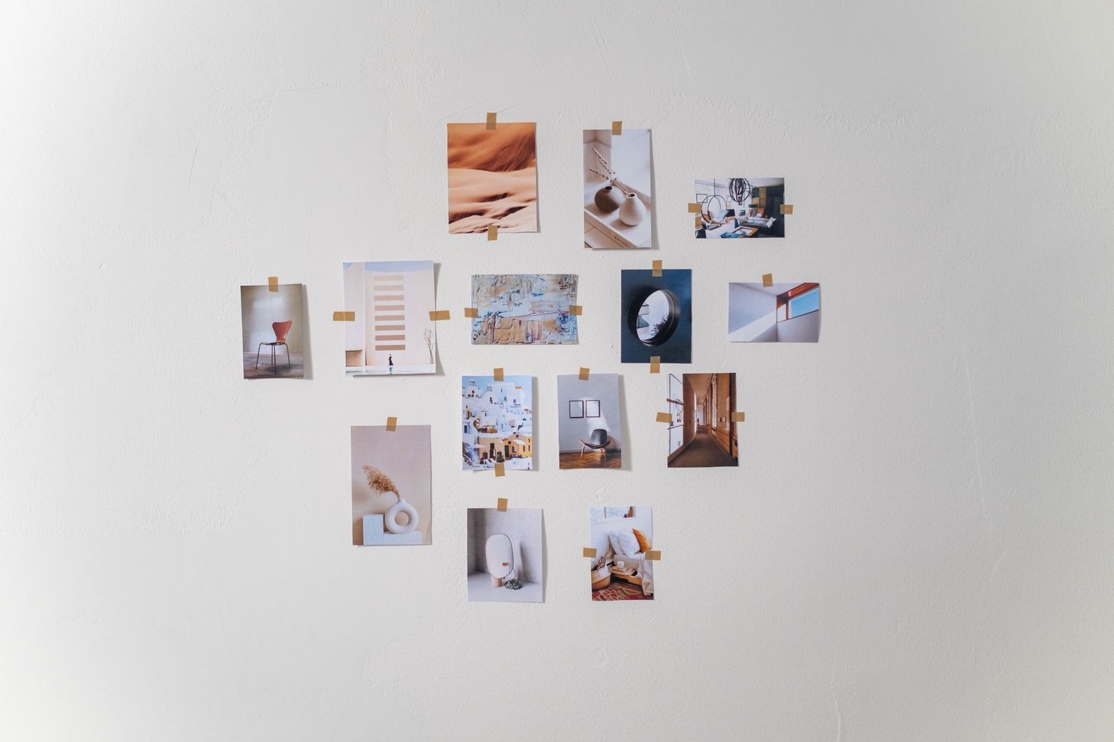
Paper cutouts offer another smart approach. Trace each frame onto kraft paper or newspaper, cut them out, and tape them to the wall with painter's tape. You can live with this mock-up for a few days, seeing how the arrangement feels in the actual space and making adjustments without consequence. Does it balance the furniture below? Does it feel too heavy on one side? This is the time to figure it out.
Consider your wall's dimensions too. A gallery wall doesn't need to fill every inch of available space. Sometimes a tighter, more compact arrangement makes a stronger statement than spreading frames across an entire wall. Measure your wall, then decide on the outer boundaries of your display. Most successful gallery walls work within a defined footprint rather than sprawling randomly.
Mastering Spacing and Alignment
Spacing makes or breaks a gallery wall. Too much space between frames and your collection looks disconnected, like individual pieces that happen to share a wall. Too little space and it feels cramped, making it hard for any single piece to breathe.
The magic number most designers recommend is approximately three inches between frames. This creates enough separation for each piece to stand on its own while maintaining visual connection across the entire grouping. You don't need to measure obsessively with a ruler - consistency matters more than precision. Cut a piece of cardboard to your chosen width and use it as a spacer when hanging.
For alignment, you have options. A grid layout where frames align in neat rows and columns creates a clean, contemporary feel. This works especially well when you're using frames of the same size or a limited set of sizes that can be combined mathematically. An organic, salon-style arrangement feels more collected and eclectic. Here, frames of different sizes nestle together without rigid alignment, but you should still maintain consistent spacing throughout.
Many experts suggest hanging art so the center sits around 57 inches from the floor, which represents average eye level. For a multi-piece gallery wall, this means the center point of your entire arrangement should hit that mark, not each individual frame. Stand back frequently as you hang to check the overall balance. Your eye will tell you if something feels off.
Creating Cohesion Without Matching Everything
A common fear with gallery walls is ending up with a mismatched jumble. But cohesion doesn't mean everything needs to match. In fact, too much matching can look sterile and uninspired. The key is finding a unifying thread that ties your pieces together.
A consistent color palette creates visual harmony even when the actual subject matter varies wildly. Maybe everything includes shades of blue and cream, or perhaps you're working with black and white images exclusively. This doesn't mean you can't have pops of other colors, but having a dominant palette creates a throughline.
Frame style offers another unifying element. Using the same frame finish - all black wood, all brass, all white - creates instant cohesion regardless of what's inside the frames. Alternatively, you might use the same frame profile in different colors, or mix metals within a tight family like all warm tones or all cool tones.
Theme-based curation works beautifully too. A wall of botanical prints, a collection of vintage travel posters, or family photos from a specific era all feel intentional. Incorporating a mix of different artistic mediums - photography, oil paintings, and textile art - can add textural depth to your display without sacrificing cohesion, as long as they share some common element.
Don't forget about matting. Consistent mat colors and widths can make mismatched frames feel like a curated collection. Wide white mats, for instance, create breathing room and a gallery-like sophistication, making even budget prints look more expensive.
Technical Tips for Actually Hanging Your Wall
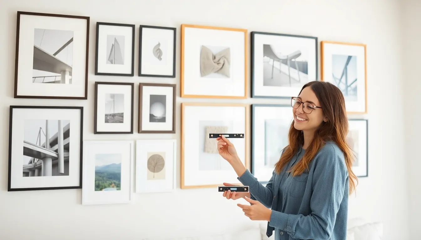
Once you've planned your layout and gathered your pieces, the actual installation requires some basic supplies and patience. Invest in a good level - both a standard bubble level and a laser level if you're tackling a large wall. Nothing undermines a beautiful gallery wall faster than frames that tilt at weird angles.
For picture hanging, the right hardware matters. Most frames come with wire or sawtooth hangers, but consider upgrading to D-rings for larger, heavier pieces. They distribute weight better and hang flatter against the wall. For the wall side, standard picture hooks work fine for lightweight frames, but anything substantial needs proper anchors or studs. Drywall alone won't support heavy artwork long-term.
Start with your anchor piece - usually the largest or most eye-catching frame. Hang this first, ensuring it's level and at the right height. Then work outward, using your floor plan or paper template as a guide. Some people prefer hanging the top row first and working down, while others start in the center and spiral outward. Choose whatever makes sense for your specific arrangement.
Command strips offer a damage-free alternative for renters or commitment-phobes. They've come a long way in recent years and can support surprising weight when used correctly. Just make sure to follow the instructions precisely and give the adhesive time to bond before hanging your art.
Step back frequently during installation. What looks right from two feet away might feel unbalanced from across the room, which is where you'll actually experience the wall most often. Make adjustments as you go rather than waiting until everything is up.
Quick Takeaways
- Plan your arrangement on the floor or with paper cutouts before making any holes in the wall to avoid costly mistakes
- Maintain approximately three inches of space between frames for a balanced look that doesn't feel crowded
- Create cohesion through consistent color palettes, similar frame styles, or a unified theme rather than perfect matching
- Hang the center of your gallery wall around 57 inches from the floor, which represents standard eye level
- Mix different artistic mediums like photography, paintings, and textile art to add textural depth and visual interest
- Start with your largest or most important piece as an anchor, then work outward following your pre-planned layout
- Invest in proper hanging hardware and a good level to ensure frames sit straight and secure long-term
Conclusion
Creating a gallery wall isn't rocket science, but it does reward thoughtful planning. The walls in your home are valuable real estate - vertical space that can showcase what matters to you while adding personality to rooms that might otherwise feel generic. Taking the time to plan your layout, maintain consistent spacing, and create cohesion through intentional choices makes the difference between a wall that impresses and one that just looks like you ran out of steam halfway through.
Start small if the whole thing feels overwhelming. A collection of four to six frames in a simple grid gives you all the impact of a larger wall with less complexity. You can always expand later as you find more pieces you love. The beauty of a gallery wall is that it can evolve with you, changing as your taste develops and your collection grows. Just remember - those first few holes are the hardest. Once you commit and start hanging, the wall comes together faster than you think. Trust your eye, measure twice, and don't be afraid to move things around until they feel right.
FAQs
How do I choose the right wall for a gallery display?
Look for walls with enough uninterrupted space to create impact - typically at least four to five feet wide. Living rooms, hallways, and stairwells work particularly well. Avoid walls with competing focal points like large windows or fireplaces unless you're intentionally creating a frame around them. The wall should get decent lighting, either natural or from fixtures, so your art can actually be seen and appreciated.
Can I mix frame colors in a gallery wall?
Absolutely, but do it with intention. Mixing metals like brass and black iron can look sophisticated if the pieces share other commonalities like mat color or subject matter. A random mix of woods, metals, and painted finishes often looks accidental rather than curated. If you're mixing frame colors, try limiting yourself to two or three distinct finishes and repeating each one multiple times across the wall.
What's the best layout for odd numbers of frames?
Odd numbers actually create more dynamic, visually interesting arrangements than even numbers. For three frames, try a simple triangle with two on bottom and one centered above. Five frames work well in a cross pattern with one center frame and four surrounding it. Seven or nine frames give you flexibility for asymmetric, salon-style layouts where you can balance visual weight without rigid symmetry.
How do I hang a gallery wall on textured walls?
Textured walls require extra attention to ensure frames hang flush. Use longer nails or screws that penetrate beyond the texture into solid drywall. For heavily textured surfaces, consider using adhesive velcro strips on the back corners of lighter frames to prevent tilting. Some people sand down small sections behind where frames will hang, though this only works if you're committed to that layout long-term. Alternatively, embrace frames that sit slightly away from the wall as part of the dimensional, collected look.